
Blog
How We Rebuilt a Builder's Website With Claude in a Week
Josh Packham's Wix site hid his best work and loaded slowly on phones. We used Claude to design and build a faster replacement for a fraction of the usual cost.
Josh Packham is a builder in Brighton. He served in the Army, has worked in construction since 2013, and has run his own firm since 2017, with a team of eight doing extensions, loft conversions and kitchens across Brighton & Hove and West Sussex. His work is very good, and until this month his website didn't show it. The new one is live now at jcpackham.co.uk.
We replaced the site in a week, with Claude doing most of the work, for a fraction of what a designed-from-scratch site would cost. This post covers how, and how we stop Claude turning out the same AI-looking site as everyone else.
What was wrong with the old site
Josh's site was on Wix. That's a perfectly sensible place for a small firm to start, but by now it had a few problems.
It hid the work
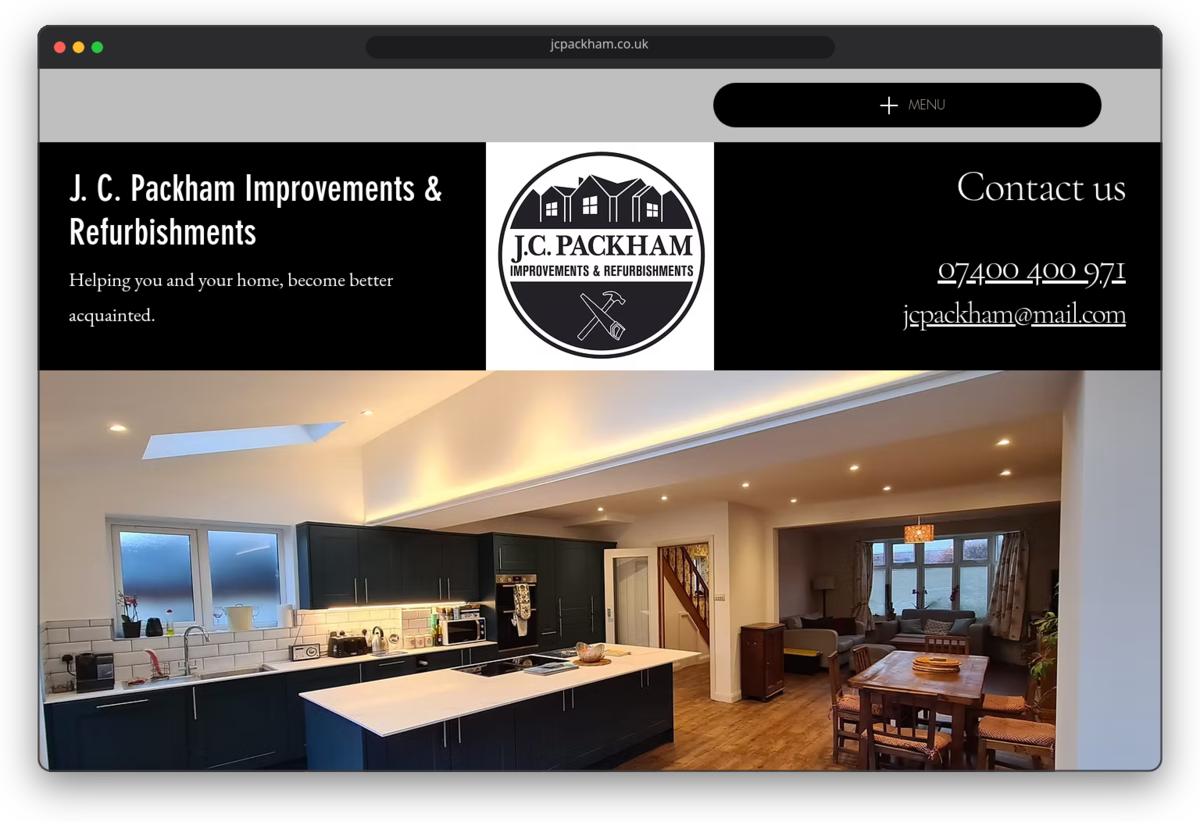
For a builder, photos are the pitch. Nobody chooses a builder from a paragraph. The homepage had one large kitchen photo, and everything else sat on a separate portfolio page in folders named by the template rather than by Josh: "home additions", "interior design" and "internal renovation". His loft conversions were filed under "interior design".
The good photos weren't on it
When we asked Josh for pictures, he sent 29 from the last 12 to 18 months, straight off his phone, and they were much better than anything on the site. One set showed a garden room, which the old site didn't mention at all.
The words could have been anyone's
Each service had a paragraph along the lines of "transforming your home with an extension can be a daunting task". That's true of every builder in the country. The tagline, "Helping you and your home, become better acquainted", didn't say what Josh does.
It was slow on phones
We ran Google's Lighthouse test on the homepage in its mobile mode. The main image took 5.3 seconds to appear, and the page made 168 separate requests to load. That's a long wait for someone deciding whether to ring you.
None of this is unusual. Most small business sites look like this after a few years on a website builder.
How we built the new one
We build with AI coding agents. Here that meant Claude Code, Anthropic's coding agent, which writes code, runs it, looks at the result and fixes what's wrong. It worked through the job while Phil reviewed and approved each step.
On the first afternoon, Claude read the old site, pulled out every fact Josh had written about his business, and built two different homepage designs from his photos. Both went online the same day so Josh could look at them on his phone, and he picked one.
Two days later the whole site was up, built from the design he chose:
- a homepage
- a projects page you can filter by extensions, lofts and kitchens
- a page for each service
- a contact page with a quote form
Claude also set up redirects, so anyone following an old Wix link or Google result lands on the right new page, and it checked every page at desktop and phone sizes before Phil saw it.
Later in the week Josh sent over his high-res photos and a few amends. We threw them at Claude and they were live the next morning. No stress.
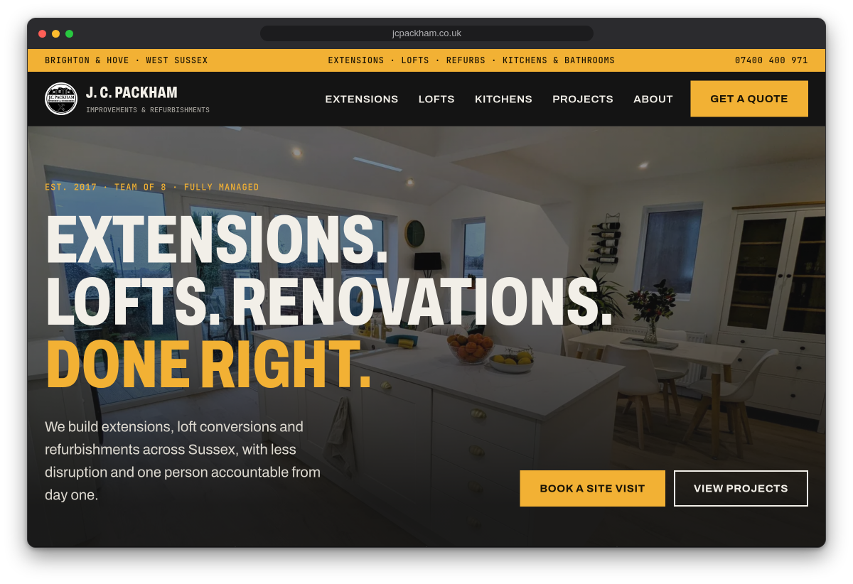
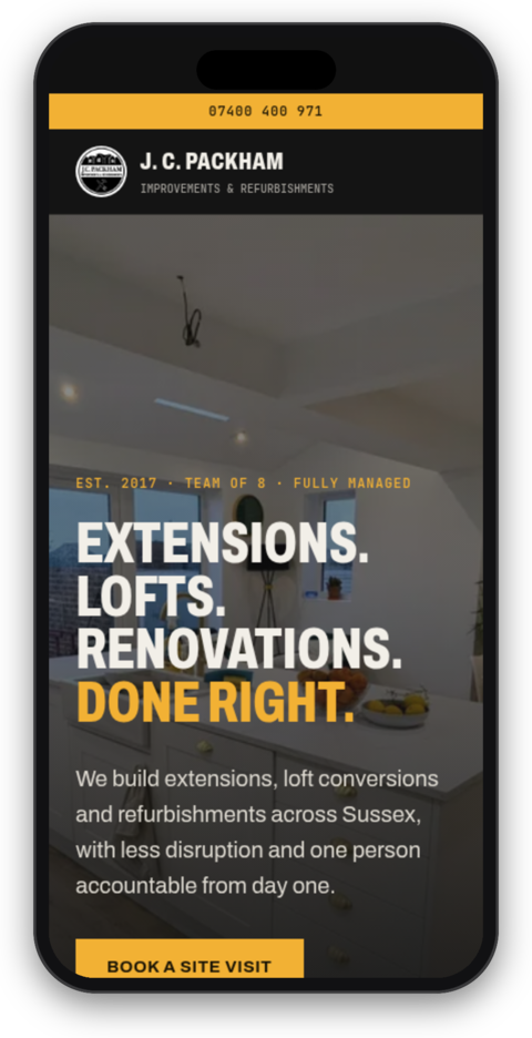
In the same mobile test, the new homepage's main image appears in 2.0 seconds instead of 5.3, and the page makes 20 requests instead of 168. Its performance score went from 79 to 98 out of 100. On phones there's a call button fixed to the bottom of the screen, so ringing Josh is always one tap away.
Why it doesn't look like AI made it
Ask Claude for a website with no other instructions and you get the site everyone gets: a soft gradient, rounded cards, a centred headline that could belong to any software startup. People have started calling it AI slop, and once you've seen a few you can spot one immediately.
We don't use Claude on its defaults. Before it touches a layout, our setup loads three design skills, which are sets of written instructions Claude follows while it works: Anthropic's own frontend-design skill, a taste skill that steers it away from the generic choices it would otherwise make, and UI UX Pro Max, an open-source library of design styles, colour palettes and font pairings matched to different kinds of business.
So Claude wasn't asked for "a website". It was asked for a builder's website, with rules for what one should look like. Josh's site is dark charcoal with an amber accent, set in heavy condensed capitals, with his photos doing most of the talking. It looks like a building firm, not a tech company.
That's what most small businesses need. In Phil's experience, about nine in ten don't need a one-off design from a design agency. They need a site that loads quickly, shows their work properly, says plainly what they do and where, and makes it easy to get in touch. Someone planning a loft conversion isn't judging the typography. They want to see a loft like theirs, and a phone number.
What still needed a person
Claude wrote the code and the first drafts, but the judgement came from Phil and from Josh.
Left unchecked, Claude building a builder's website could easily write glowing testimonials or claim the firm is "fully insured", because that's what builders' sites usually say. We gave it a firm rule to use only facts Josh had told us. Every number on the site (2017, a team of eight, extensions in about 12 weeks, lofts in 10 to 12) is his. When he sends real reviews, they'll go on with the source named.
It also doesn't know the client. Josh groups his work into extensions, lofts and kitchens. He has a couple of bathrooms and garden rooms, but not enough for their own sections, and the site follows his call on that.
Why it cost less
Most of the cost of a small website is time, and most of that time goes on design and build. Here those stages shrank: two working designs in an afternoon, a full site two days later, photos sorted in minutes. We still did the parts that need experience, which were choosing the approach, checking the work, keeping the facts honest and dealing with Josh.
If your website looks like Josh's old one, the fix is usually your best work on the homepage and a phone number people can tap, and a design agency is optional. We can help with that.